As software projects grow, maintaining consistency in UI and UX across different features and teams becomes increasingly challenging. This is where component libraries shine. A well-designed component library provides a single source of truth for your application's building blocks, ensuring a consistent look and feel, promoting reusability, and accelerating development.
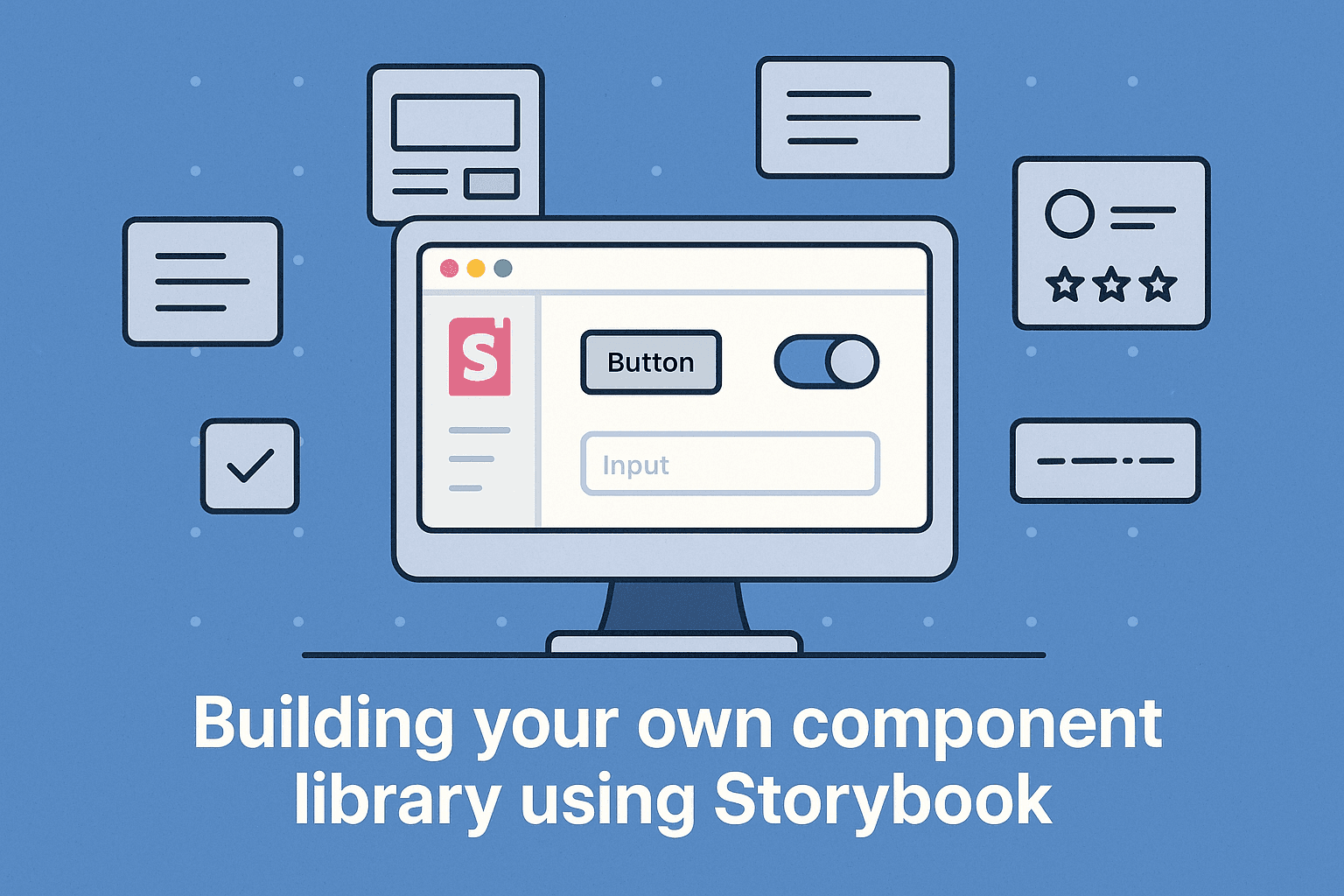
Storybook is an open-source tool that has become the standard for developing, documenting, and testing UI components in isolation. It provides a dedicated environment where you can build components without needing to run your main application, making development faster and more focused. In this post, we'll walk through the process of creating your own component library and using Storybook to manage and showcase your components.
Why Build a Component Library?
Consistency
Ensures a uniform look and feel throughout your application.
Reusability
Components can be used across different pages and projects, reducing duplicate code.
Faster Development
Developers can grab pre-built, tested components instead of building from scratch.
Improved Collaboration
Provides a clear overview and documentation of available components for the whole team.
Easier Maintenance
Updating a component in the library propagates the changes everywhere it's used.
Developer Experience
Improves onboarding and reduces cognitive load for engineers working on the codebase.
Introducing Storybook
Storybook is a UI development environment that allows you to visualize components in different states. Each "story" is a specific state of a component, allowing you to see how it renders with different props, data, or configurations.
Key features of Storybook include:
- •Isolated Development: Build components independently from your main application logic.
- •Documentation: Automatically generates documentation based on your stories and component code.
- •Addons: A rich ecosystem of addons for testing, accessibility checking, design token integration, and more.
- •Interactive Playground: Adjust component props and see the changes live.
Steps to Create Your Component Library with Storybook
Let's outline the general steps involved:
Project Setup
You'll typically start with a new project for your component library. This could be a separate repository or a monorepo structure. You'll need a package manager (npm or yarn) and build tools (like Babel and webpack, often configured by tools like Create React App, Vue CLI, or directly if using Next.js in a monorepo setup).
Install Storybook
Storybook provides a command-line interface (CLI) to help you set up. Navigate to your project directory and run:
npx storybook initThis command will detect your project's front-end framework (React, Vue, Angular, etc.) and set up the necessary dependencies and configuration files.
Create Your First Component
Let's create a simple Button component as an example.
// src/components/Button.jsx (Using React)
import React from 'react';

const Button = ({
  label,
  onClick,
  primary = false,
  disabled = false
}) => {
  const baseStyles = "px-4 py-2 rounded focus:outline-none";
  const primaryStyles = primary
    ? "bg-blue-500 text-white hover:bg-blue-600"
    : "bg-gray-200 text-gray-800 hover:bg-gray-300";
  const disabledStyles = disabled ? "opacity-50 cursor-not-allowed" : "";

  return (
    <button
      type="button"
      onClick={onClick}
      className={`${baseStyles} ${primaryStyles} ${disabledStyles}`}
      disabled={disabled}
    >
      {label}
    </button>
  );
};

export default Button;Write Stories for the Component
Create a stories file for your component. This file will define the different states of your Button.
// src/components/Button.stories.jsx
import React from 'react';
import Button from './Button';

export default {
  title: 'Components/Button', // Categorizes your component in Storybook UI
  component: Button,
  tags: ['autodocs'], // Automatically generates documentation
  argTypes: {
    label: { control: 'text' },
    onClick: { action: 'clicked' }, // Logs interactions in the actions panel
    primary: { control: 'boolean' },
    disabled: { control: 'boolean' },
  },
};

// Define different states of the button
export const Primary = {
  args: {
    primary: true,
    label: 'Primary Button',
  },
};

export const Secondary = {
  args: {
    label: 'Secondary Button',
  },
};

export const Disabled = {
  args: {
    label: 'Disabled Button',
    disabled: true,
  },
};Run Storybook
Start the Storybook development server:
npm run storybook
# or
yarn storybook
This will open Storybook in your browser, where you can see your Button component rendered in its different states (Primary, Secondary, Disabled). You can interact with the controls panel to change props and see how the component updates.
Develop and Document More Components
Continue building your components, creating stories for each one. As you add more components, your Storybook will grow into a comprehensive visual library. Utilize the argTypes and tags: ['autodocs'] features to automatically generate documentation within Storybook.
// Example of another component story structure
import React from 'react';
import Alert from './Alert';

export default {
  title: 'Components/Alert',
  component: Alert,
  tags: ['autodocs'],
  argTypes: {
    message: { control: 'text' },
    type: {
      control: { type: 'select' },
      options: ['info', 'success', 'warning', 'error'],
    },
  },
};

export const Info = {
  args: {
    message: 'This is an informational alert.',
    type: 'info',
  },
};

export const Success = {
  args: {
    message: 'Operation completed successfully!',
    type: 'success',
  },
};
How components appear in Storybook:
Primary Button
Secondary Button
Info Alert
This is an informational alert.
Success Alert
Operation completed successfully!
Integrating with Your Next.js Project
Once your component library is established, you can integrate it into your Next.js application.
Install the Component Library
If your library is in a separate repository or published as an npm package, install it in your Next.js project. If it's in a monorepo, you can usually reference it directly depending on your monorepo tooling (like npm workspaces or pnpm workspaces).
cd your-nextjs-project
npm install your-component-library
# or
yarn add your-component-library
Import and Use Components
You can now import components from your library into your Next.js pages and components.
// pages/index.js (in your Next.js project)
import Button from 'your-component-library/components/Button'; // Adjust path based on library structure

export default function Home() {
  return (
    <div>
      <h1>My App</h1>
      <Button label="Click Me!" onClick={() => alert('Button clicked')} primary />
    </div>
  );
}
Maintenance and Collaboration
Maintain your component library as a separate, versioned entity. Encourage team members to develop new components or update existing ones within the library and their respective stories. Storybook serves as a fantastic collaboration tool, allowing designers and other stakeholders to see and interact with components without needing a full development environment setup.
Development Workflow Benefits
Before Component Library
- ✗Scattered component definitions
- ✗Inconsistent styling and behavior
- ✗Reinventing components for each project
- ✗Poor documentation and discoverability
With Component Library
- ✓Centralized component source of truth
- ✓Consistent UI across all applications
- ✓Reuse components across multiple projects
- ✓Self-documenting with interactive examples
Conclusion
Building a component library is a valuable investment for any growing front-end project, and Storybook makes the process efficient and enjoyable. By developing components in isolation and documenting them effectively, you create a robust, reusable, and maintainable UI system that will accelerate your development process and improve consistency across your applications. Start building your library today and experience the benefits firsthand!